Need a CTA Button? Get One for FREE
CTA stands for Call to Action, and on your website it should be a button.
When I meet with clients the first thing I ask them is:
What do you want people to do?
Obviously there are many things that can be done on your website, but what is the most important? If you had a choice, what would you want people to do? What is the best ACTION a visitor can take for YOUR business? This is your Call to Action.
Why a Button?
Many studies have been performed around the best way to present the call to action on your website. The size, shape and color of your button has been discussed ad nauseum. The most important thing to remember is to have a limited number of CTA’s per page. A single CTA is the best.
As for size and color, the goal is to make sure it stands out. The key is to make it HIGH CONTRAST so it pops out on the page.
The Blur Test
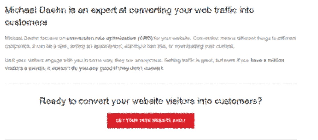
Not sure if your CTA button stands out? Try scrolling up and down the page fast enough that you can’t read the copy. Do you still know where to click? Or you can try blurring out the copy and see if it is still clear where to click:
Even with the copy blurred, you still know where to click, on the high contrast red CTA button.
Get Your Free CTA Button
Yes I actually created some promotional buttons you can pin on your shirt, backpack or denim jacket. But if you want a CTA button that helps your website I will add one to your site for free as well. Click the button below to send me an email and get your free CTA button.


